
An idea popped in my head when I was running the other day.
This happens a lot when I run. When I run my mind gets to wander. I agree with David Goggins that listening to music when running is cheating. It’s important to be inside my own head, alone. The physical benefits of running are unmatched for me, but the mental benefits are real as well.
Anyway, what popped into my head was the book Whatever You Think, Think the Opposite by Paul Arden. There’s a page in the book where he visualizes the lives of two imaginary people with a line graph. Arden says, “This chart compares the working life of the average corporate person with that of a maverick.”


As I’ve mentioned before, I’m fascinated with career Second Acts. I thought it could be really interesting to map the working lives of people who transition from one career to another, calling out certain points along the timeline that contributed to the eventual switch.
This a rough sketch I made last night of Anthony Bourdain’s life:
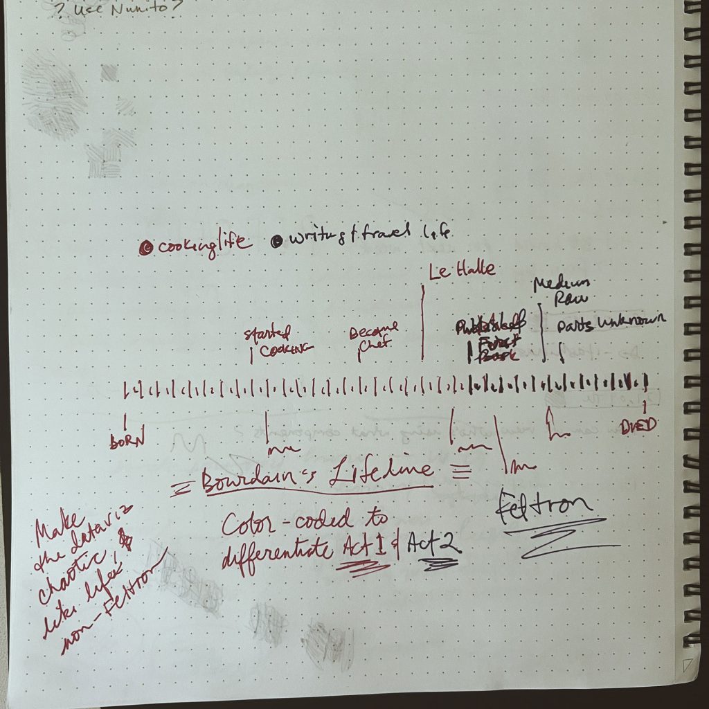
I want to see if any patterns emerge when we plot important life events that happen over the course of a person’s career. The idea is to color-code categories of event and job types. In Bourdain’s case the first two categories would be his cooking life events and his writing & travel life events.
Since a lot of this project is still in my head and not yet on paper, things will like change shape a lot.