
The Gist: Stay vigilant with your website. Always be thinking about how you can make it better. Don’t let it go stale, but also don’t relaunch it without first conducting proper reviews, critiques, and testing.
Yesterday tech news website (blog?) The Verge debuted a new design. It’s not good, but I don’t think it’s for a lack of trying. I get the sense from Nilay Patel’s article they were excited to share it with the nerds of the world. If I were to speculate what went down, which I’m going to do right now, I’m going to say they didn’t conduct any user testing before relaunching. User testing is important in design.
Design is not art. Design performs a function in the world, whether it’s the design of a book, website, operating system, or car. When I started my career as a web designer in the dark ages of 1999, I knew nothing of competitive analysis, user testing, or A/B testing. None of it existed back then.
So when I see a landing page that looks like this, I see a big mess:
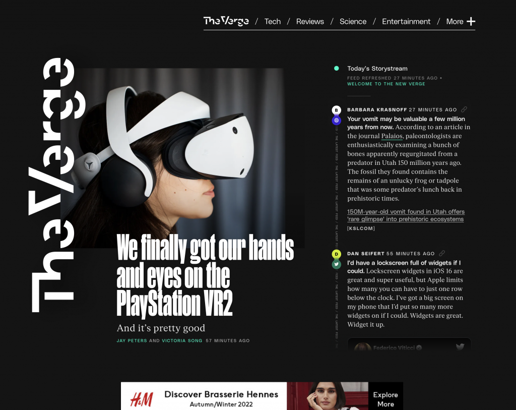
There’s a lot to unpack in this new design and I could make this critique 5,000 words, but I don’t have the time.
In short, they’ve smashed together a Twitter-like news feed alongside more prominent articles. The titles of those headlines are set in an extremely hard-to-read typeface (Manuka) and putting the entire site on a black background makes for a horrible reading experience. It’s hard on the eyes. When you drill down into individual article pages the format is more traditional and thankfully the text sits on a much more readable white background, but the dark landing page and light article pages make the site feel disjointed.
They designed and built this new site in-house, in a bubble, without a fresh, outsider perspective.
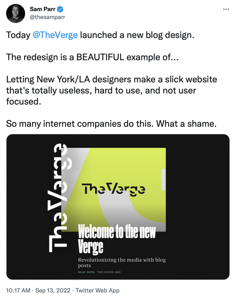
On Twitter, James Parr offers a similar thoughts:
In Nilay’s post he recounts advice from tech news veteran Walt Mossberg:
Our former colleague Walt Mossberg always reminds me that reinvention is important; this new site represents the biggest reinvention of The Verge since we started the whole thing.
Walt is right. reinvention is important, but so is usability and testing.
The moral of this story is if you have a website you use to communicate with the world, be vigilant with it. Adapt to the changing landscape of media formats and devices on which people read the news, but balance your raw, emotional ideas with outside feedback, internal critiques, and testing.
My guess for what comes next is that this current redesign gets a redesign. Some tweaks here, some adjustments there, and things eventually get watered down to something more readable, but also more bland. Design death by a thousand cuts.